Williamsfield seeking consistent look
By NICK VLAHOS
For The Weekly Post
WILLIAMSFIELD – “Logo Roulette” no longer is being played in Williamsfield.
With hopes of presenting a consistent look, the Williamsfield Village Board winnowed to one the number of logos municipal government is to use officially.
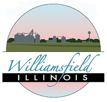
The pastels-heavy logo features a farmscape with “Williamsfield” written in script and “Illinois” written below it in block letters.
The logo is one of three or four being used in various places, including on signs that welcome drivers approaching town, according to Village President Robert Johnson.
That number was too many, in his view. In at least one case – on village letterheads – there was no logo at all.
“We want to be uniform,” Johnson said. “We need something for our website, our letterhead, our business cards. It all needs to look the same.”
Johnson suggested the logo that prevailed has a fresher and more modern design than the others that were being used.
“It gives a better flow,” he said. “The other ones we have show historical things. Not to degrade them, but it looks more like you’re a frontier town. It looks like there should be a gambling joint there.”
Johnson said he doesn’t know who designed the chosen logo, nor how long the village has been using it.
In January, the board authorized the logo consolidation.
Trustee Andrew Scott said he didn’t particularly care for the pink shade of the chosen logo but ultimately voted to approve the design, according to Village Clerk Tori Courson.